Le Magnolia, a project I am working on as I write this, is a case study in how user-centered design solves critical problems in the floral arrangement business. My role is to lead the design of a new e-commerce platform for the company's premium product line, differentiating it from their current offerings. The UX challenge is to craft an experience that simplifies product visualization and purchase, minimizing friction at every step. Operating on a low budget, this project demands ingenuity to uncover hidden problems and build effective communication with the user.
My Role
Le Magnolia represents a direct and personal client partnership. As their trusted designer, my primary role is to lead the creation of a new e-commerce that elevates the brand by focusing on its premium product line. The goal is to strategically differentiate Le Magnolia from its current presence on mass-market platforms like Teleflora.
UI/UX Designer: I am in charge of the end-to-end design cycle, from conceptualization to the final interface. My task is to create a visual and functional experience that is not only attractive but also communicates the superior value and quality of purchasing through this channel.
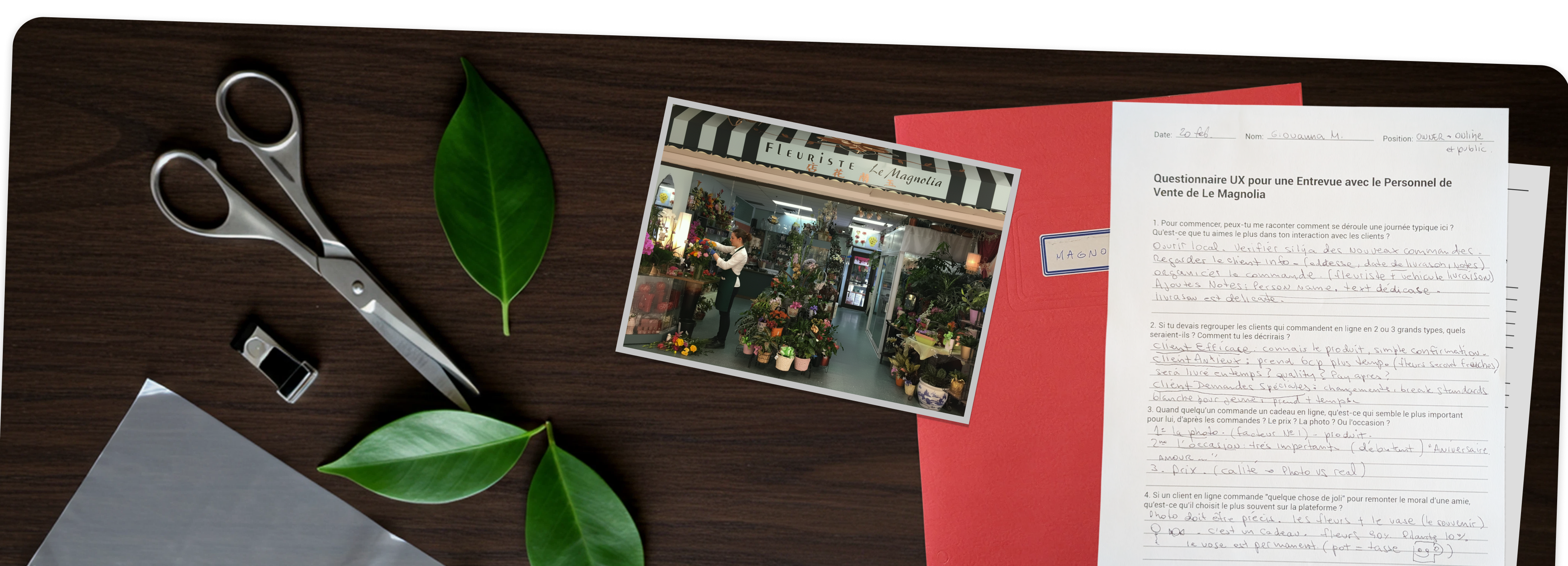
Resourceful User Research (Guerrilla Research): Operating on a limited budget, my research approach is based on seeking the maximum amount of information using the fewest resources. To gain a deep understanding of the user, I am combining three key information sources: a competitive analysis of similar sites, a study of existing customer records, and direct interviews with the sales staff and the person in charge of the online channel, who are in daily contact with customer needs and frustrations.
The Challenge: Creating a Clean and Effective Storefront
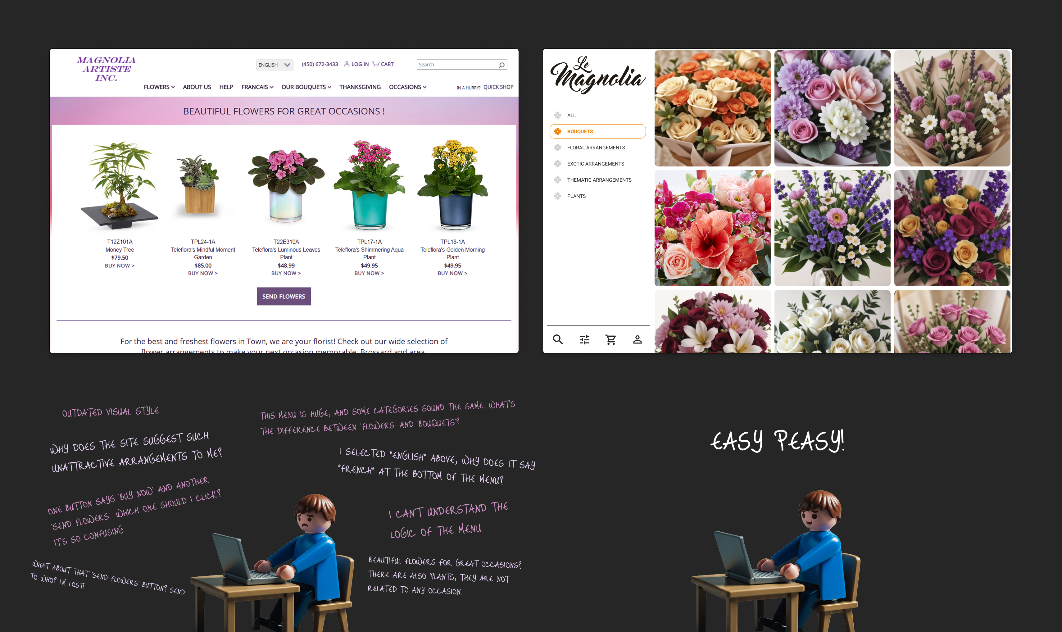
The challenge was to create an e-commerce alternative to mass-market platforms like Teleflora with its 40,000 member florists. The goal was to design a local and exclusive shopping experience for my client's premium product line, focused on a specific delivery area (MTL and Riviere Sud), to capture a higher-value market and with 100% control for the company.
The Approach: A Visual and Frictionless Experience
My approach was to design a simple and intuitive e-commerce, inspired by how social networks like Instagram put the image at the forefront—a more visual concept with a simple menu. Part of the strategy focused on identifying and eliminating key pain points in the purchasing process to simplify and facilitate the customer's decision.
Outcome: Early Validation and Positive Results
Although the full website is still in development, the results from the initial implementations are very positive. We have validated easier navigation and a clearer presentation of information. Most importantly, these improvements show a more optimized purchasing process and a potential reduction in customer complaints, easing the sales process for Le Magnolia.
My UX Process: From Business Goals to User Needs
Phase 1: Discovery and Strategic Definition
My first step was to align with the business goals through two strategic meetings with the owner of Le Magnolia. In these sessions, I not only identified her existing needs and difficulties with her current platform (Teleflora), but also helped her define a clear strategic direction: to create an independent e-commerce site for her premium products, free from Teleflora's sales commissions and with complete catalog freedom.
Phase 2: User Research & Understanding (Guerrilla Research Approach)
With a clear vision of the business's strategic needs, and acknowledging a limited budget, my goal was to deeply understand Le Magnolia's customers without incurring significant expense. To achieve this, I combined highly effective and cost-efficient research methods:
A. Internal Expert Interviews (Proxy for Customer Insights):
I created a structured questionnaire and conducted exhaustive interviews with the sales team. With years of direct customer interaction, they acted as a valuable "proxy" for the customers, providing first-hand accounts of the most frequent questions, curiosities, and common complaints.
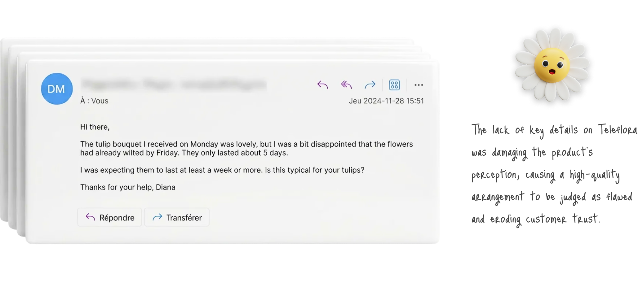
B. Qualitative Data Analysis (Complaint Review):
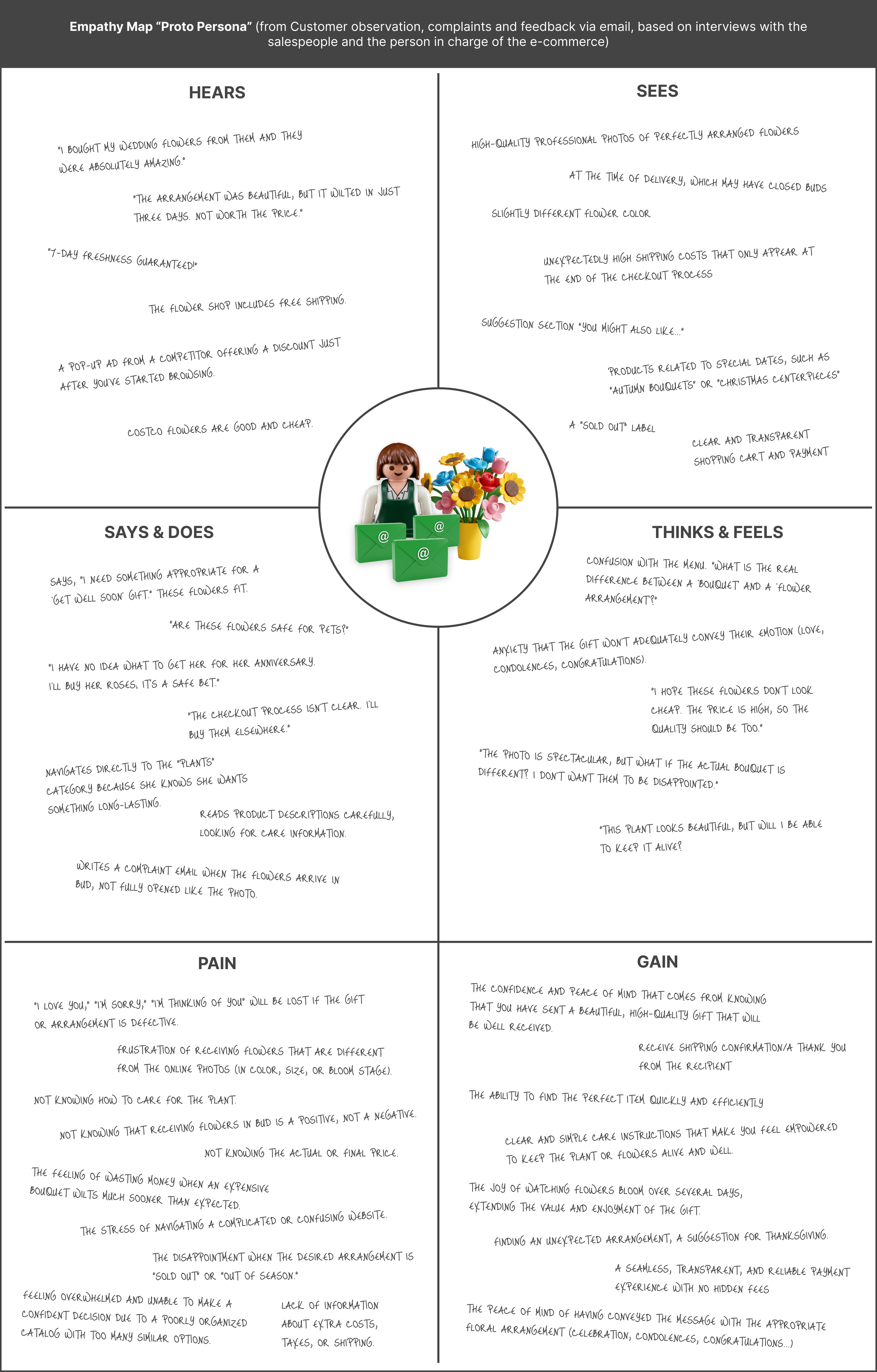
I accessed and analyzed the email records of past customer complaints. This qualitative data analysis revealed a fundamental insight: many reported problems were not due to issues with product quality, but rather stemmed from a communication deficiency that led to a mismatch in customer expectations.
Key Pain Points Uncovered Through Customer Feedback (from Complaints & Sales Team): The customer emails and sales team's insights highlighted several recurring pain points, primarily due to a gap between user expectations and the natural reality of organic products. These were visually summarized for clarity:
Expectation vs. Reality (Longevity): "My tulips only lasted 5 days."
Expectation vs. Reality (Color): "The hydrangeas on the page are deep pink and I received a softer tone."
Expectation vs. Reality (Blooming): "My lilies arrived closed, not open like in the photo."
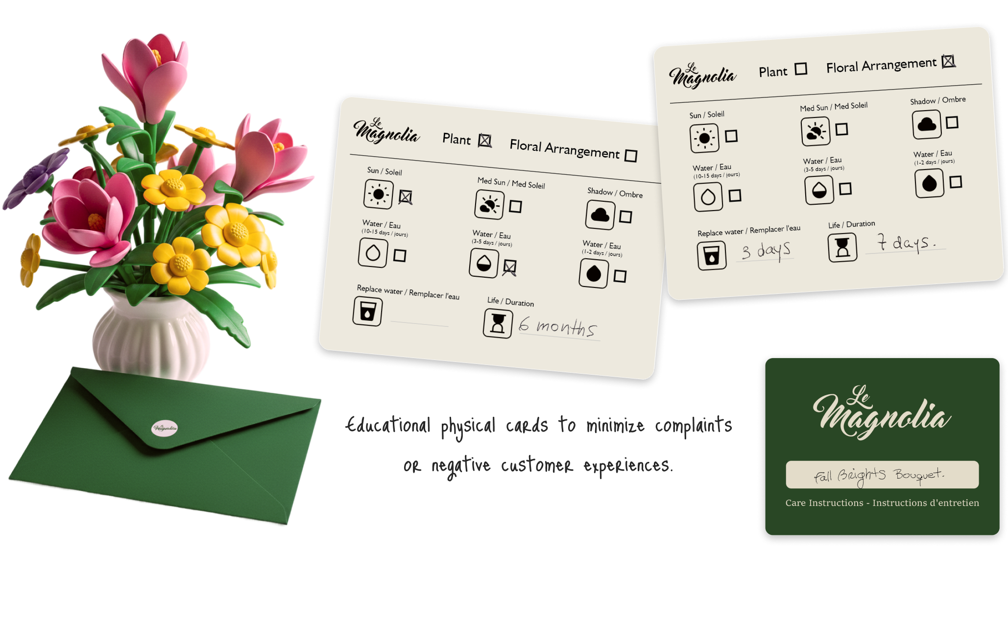
Expectation vs. Reality (Care): "The plant I bought is not good quality, I water my plant every day and it's getting worse."
My Responsibility as a Designer:
Based on these critical findings, my responsibility was clear: to minimize these post-purchase pain points by significantly improving the pre-purchase experience on the website. This meant designing a solution to better educate users and set clear, realistic expectations about the natural characteristics and care requirements of organic products.
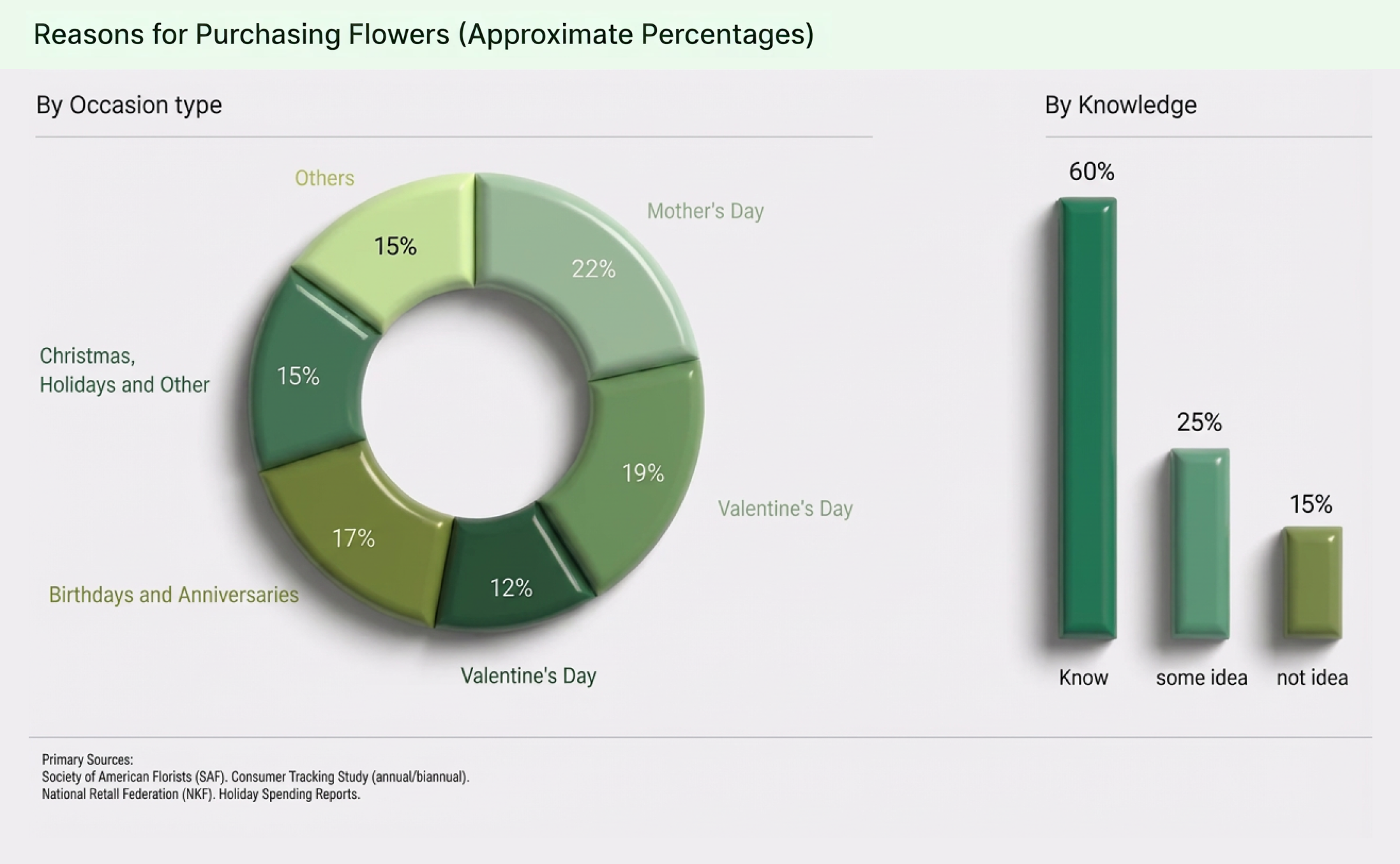
C. Secondary Research (Market & Generic User Behaviors):
To complement the qualitative data, I conducted secondary research to obtain broader, generic insights into user purchasing behaviors within the flower shop industry. This stage helped validate internal findings and provided a quantitative perspective on user motivations:
This research revealed key user profiles and their decision-making processes:
The Decisive Buyer: Knows exactly which plant or flower they want and doesn't waste much time searching, often going directly to the salesperson (or a clear product category online).
The Occasion-Driven Buyer: Seeks a solution for a specific event (birthday, anniversary, etc.). This person usually has little to no specific knowledge about flowers and needs something appealing that fulfills the purpose of their visit.
Key Insight for Information Architecture: The overarching finding was that both of these user groups have generally decided beforehand is whether they are looking to buy a bouquet of flowers, a floral arrangement, or a plant when they approach the shop or website.
After the interviews, I built an empathy map. Although it wasn't based on direct customer surveys, the insights from conversations with the sales team about their customer interactions and anecdotes enabled me to create a map that would also serve as a guide.
Phase 3: Synthesis, Information Architecture & Design Strategy
The consolidated data from internal interviews, customer complaints, and secondary market research provided a much clearer and data-backed vision of user behavior and pain points. This understanding directly informed the foundational design decisions for the e-commerce platform:
A. Information Architecture (IA) Defined by User Intent:
Leveraging the key insight that users primarily decide on the type of product (bouquet, arrangement, plant) before engaging in deeper browsing, I designed the site's information architecture around a clear product-type categorization. To effectively cater to both decisive and occasion-driven buyers, categories were primarily visualized by product type (e.g., "Bouquets," "Floral Arrangements," "Plants"). Crucially, an explicit "by Occasion" option was integrated within these categories. The default product view would be "All," functioning as a comprehensive showroom.
B. Streamlining the Purchase Process: Design Principles & Features:
With a solid IA and a deep understanding of user needs and behaviors, I focused on implementing design principles and features aimed at simplifying and enhancing the attractiveness of the purchase journey:
Visual Impact: Recognizing that flowers and plants are highly visual products designed to entice customers, attractive, high-quality photos of a considerable size were prioritized for all product displays to maximize their appeal.
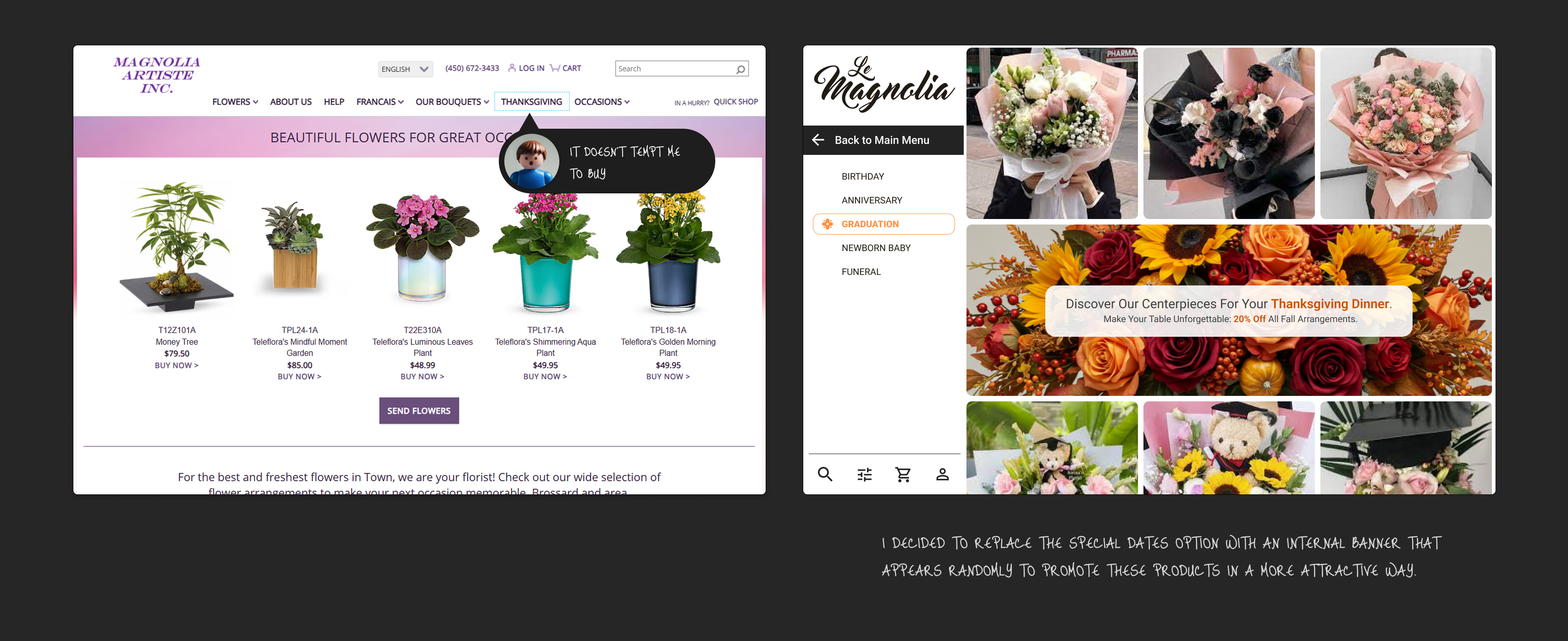
Simplified Navigation Menu: Drawing a contrast with Teleflora's perceived complexity, our menu was designed to be direct and user-centric. Its primary organization is by "product type," directly aligning with users' initial decision-making process (knowing if they want a bouquet, arrangement, or a plant), thereby simplifying their path. Reflecting its importance from research, the "Occasions" option was prominently included in the menu structure to support the occasion-driven buyer.
Reinforcing Occasions: The "Occasions" section was identified as a fundamental feature, particularly for the 30% to 40% of customers needing a clear prompt or validation for their purchase decision. This feature directly addresses their need for confirmation, for example, by stating: "This floral arrangement is indeed suitable for a Graduation."
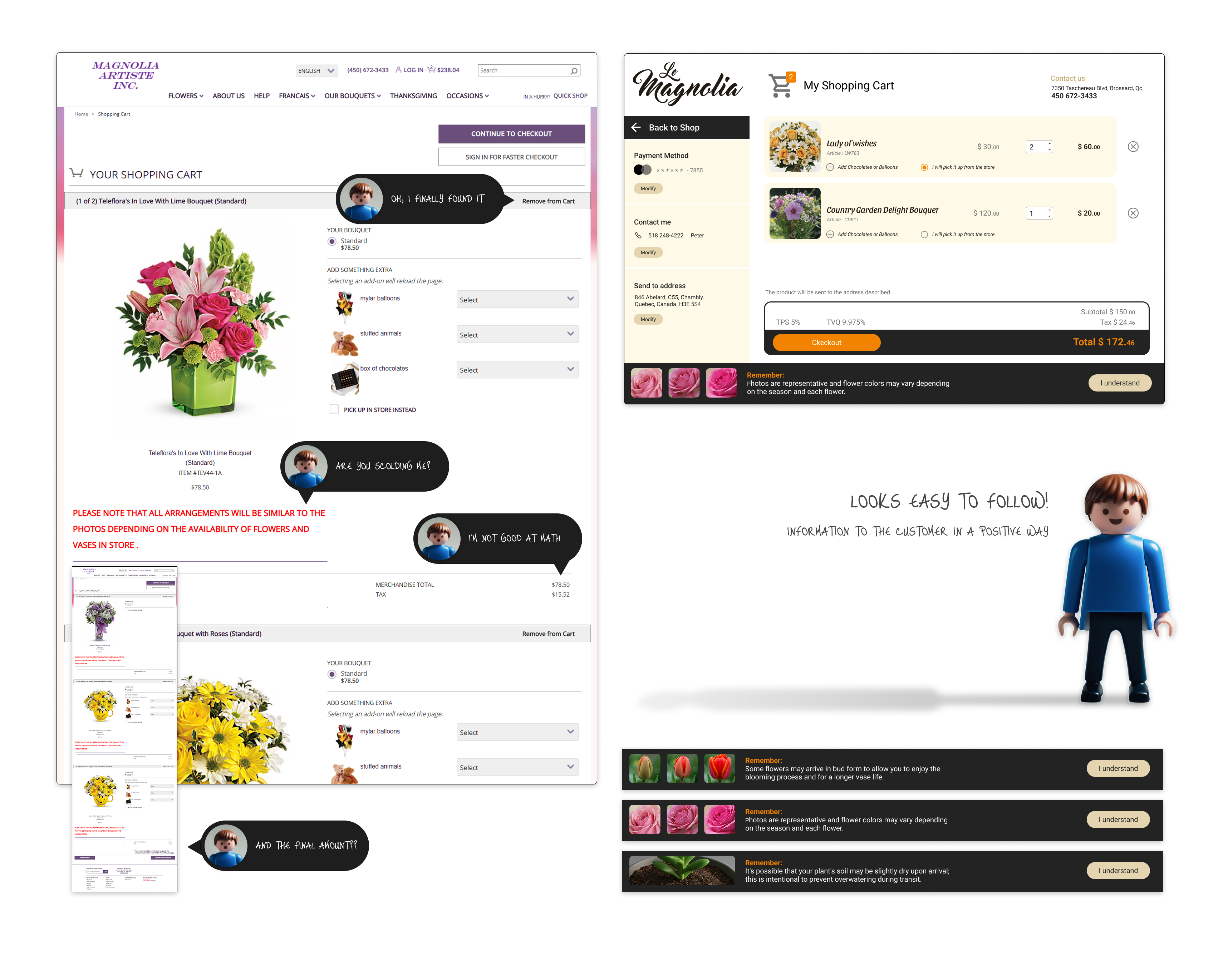
User Control & Simplified Interface: The core product browsing and selection interface was meticulously simplified, incorporating key elements to empower the user:
Intuitive Search: Providing robust search capabilities by plant name, occasion, or color.
Effective Filters: Empowering customers to refine their selection by specific criteria such as flower types (e.g., Asiatic lilies), color, price range, or product longevity, with clear visual indicators for active filters.
Visible Shopping Cart: A persistent shopping cart icon, displaying the number of items, offers continuous feedback and reinforces the user's sense of control over their purchase.
Flexible User Account Options: The site was designed to allow purchases for both registered and unregistered customers, a strategic decision to prevent the loss of occasional buyers due to mandatory sign-ups.